Google Scholar Redesign
Transforming an outdated design, guided by user needs and feedback.
Google Scholar, a branch of Google Search focused on academic texts, is widely used by researchers globally. However, its visual design feels outdated, resembling an older version of Google. This, along with other interface issues, negatively impacts the user experience. I saw this as an opportunity to update and improve its interface.
Information design
UX/UI design
January 2023
The Design
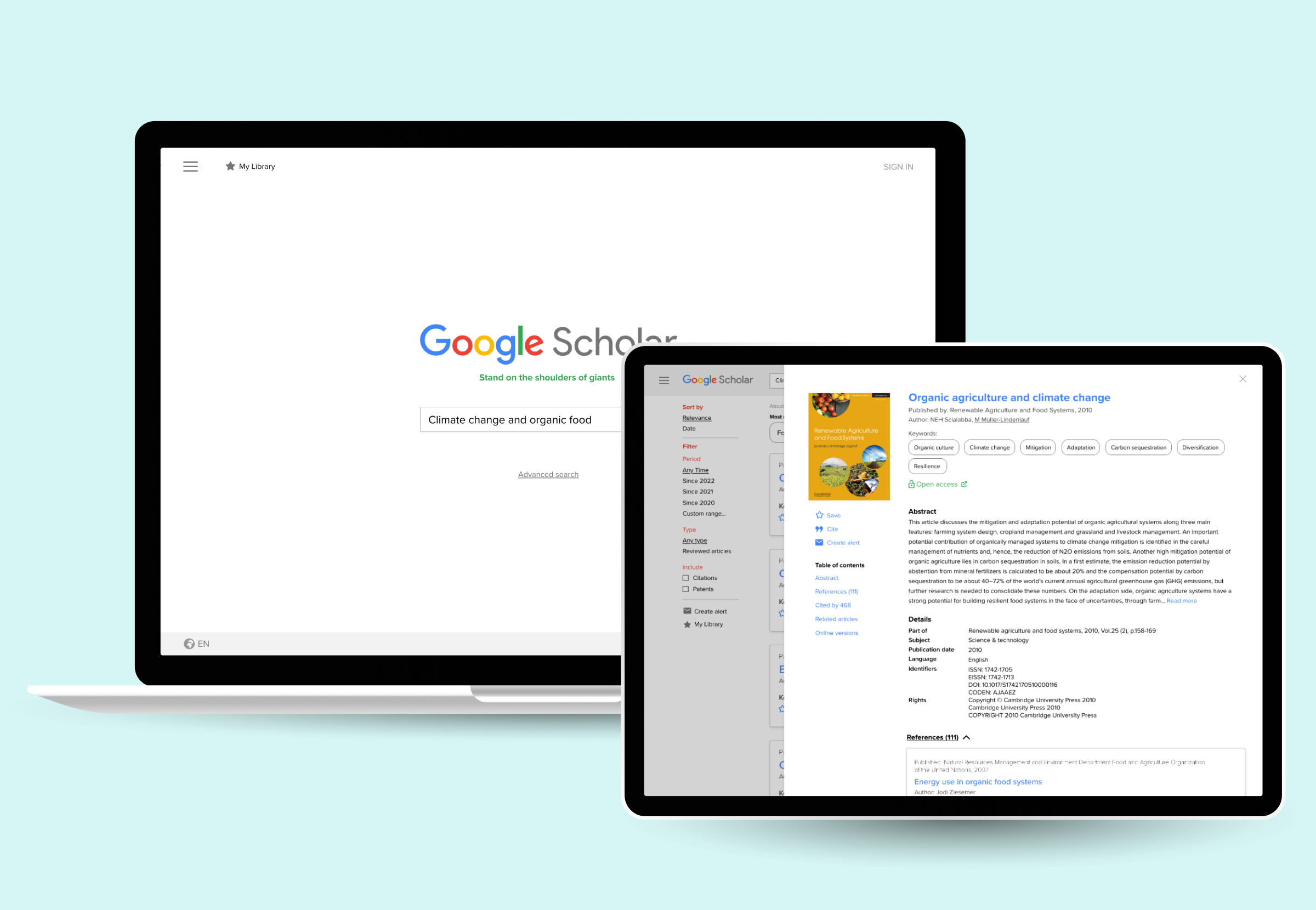
I developed the redesign by thoroughly analysing the current design and consulting with existing users and experts. Using the original layout as a foundation, I introduced new features, such as a detail page, while enhancing existing elements like the visual design and filtering system.
Identifying the main problems
After analysing the current design, conducting walkthroughs, and gathering user feedback, I identified several key issues. The visual design is unclear and cluttered, which makes navigation difficult. Additionally, important information and features, such as the summary of the paper and the “save” feature, are hidden. When users do find these features, they are not adequately explained. In my design process, I focused on resolving these problems.
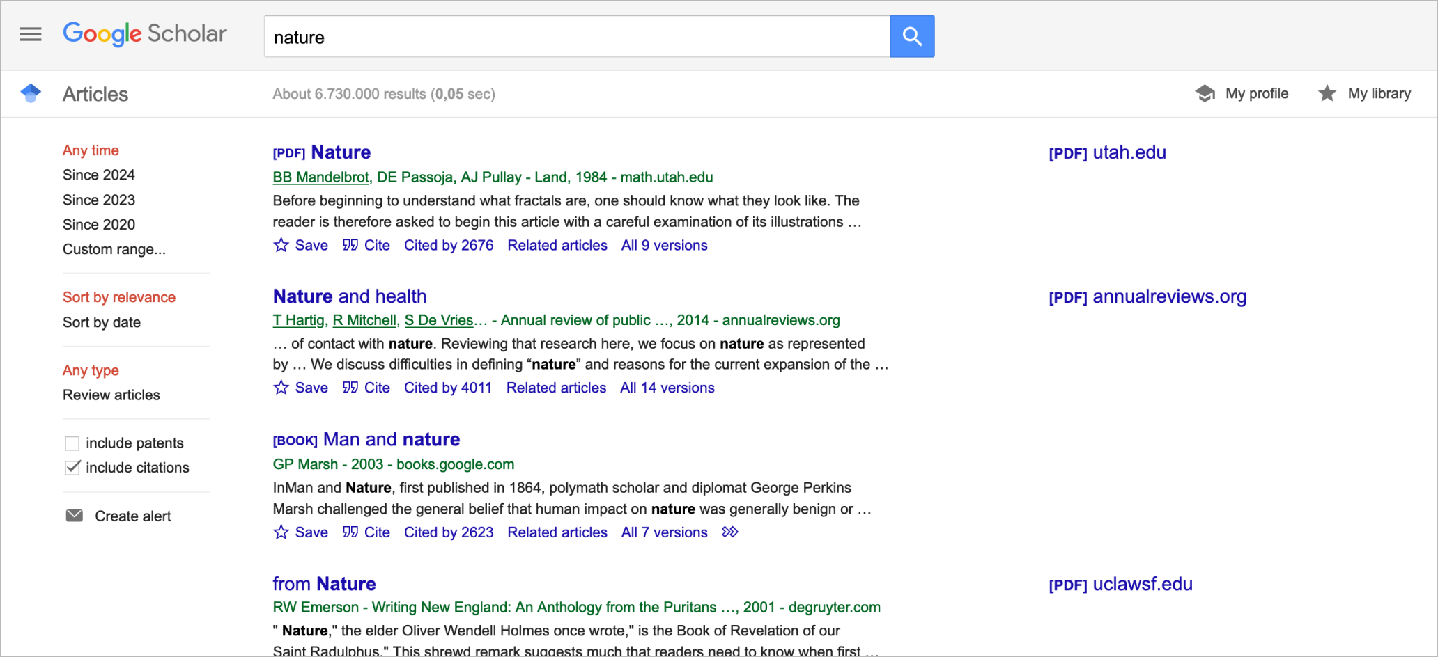
Google Scholar’s current design
Improving the design
I enhanced the visual hierarchy of the search results and incorporated essential elements into the homepage, such as the integration of keywords. These keywords are specific terms that capture the essence of a research paper’s content, a convention familiar to researchers when identifying relevant materials. By incorporating these terms into the homepage, the design aligns with practices commonly used in academic research.
Additionally I redesigned the interaction flow when clicking on a search result to improve user experience. Currently, users are redirected to the publisher’s website, which can be inconvenient—especially when they are repeatedly searching for similar information. Constant redirection increases the time and effort required to find relevant details. To solve this, I introduced a dedicated detail page within the platform. This keeps all relevant information centralized, providing a consistent and seamless experience while eliminating the need to navigate multiple external websites.
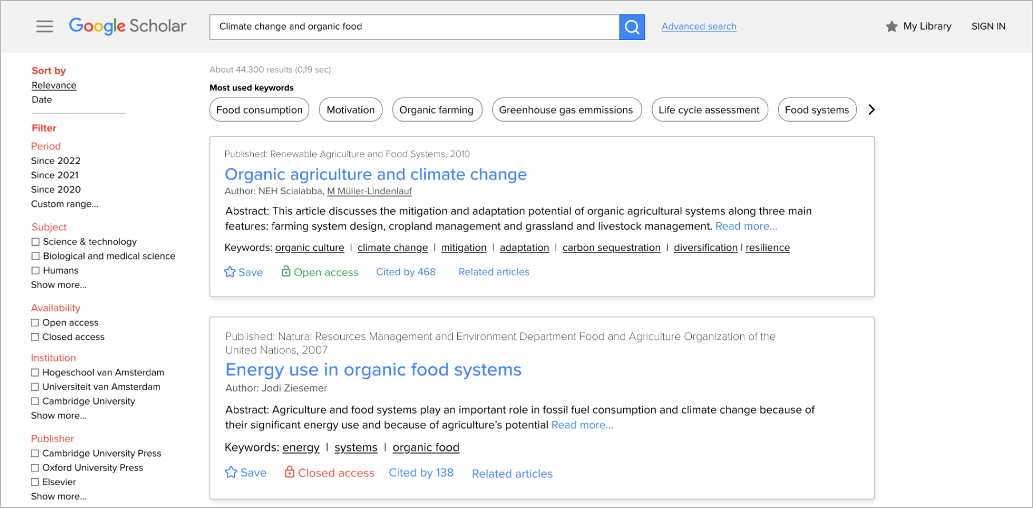
Redesigned search results page
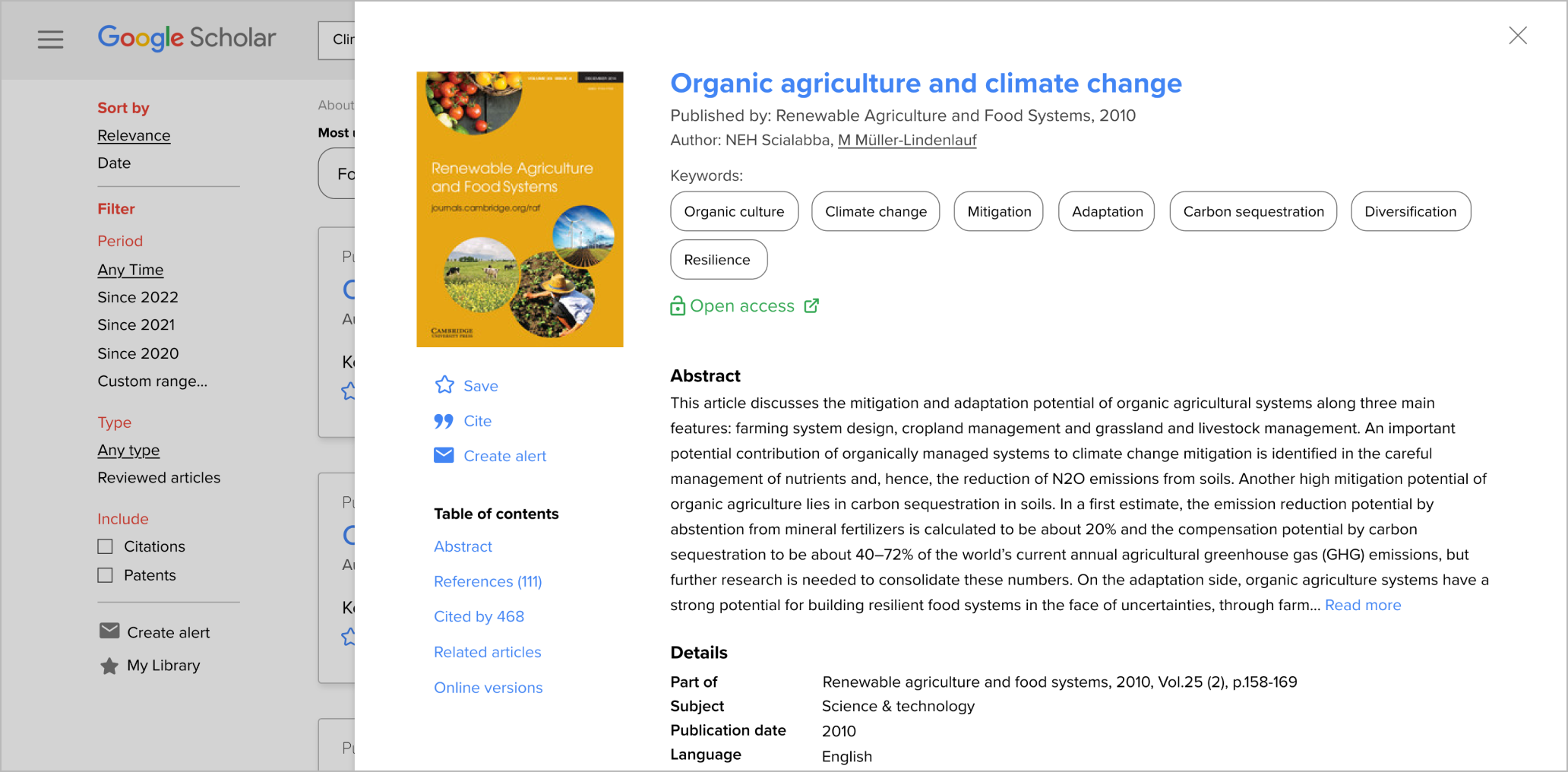
Newly added detail page
Want to read more about the process and design?
More projects

Political Wordplay
Information design / UI Design
Exploring the evolution of language in Dutch political commercials through an interactive datavisualisation.