Political Wordplay
My process and workflow
This production is part of ReFrame, a collaborative project involving Sound & Vision and the Creative Media for Social Change, a research group at the Amsterdam University of Applied Sciences. The goal of ReFrame is to explore how the vast audiovisual archive of Sound & Vision can be utilized to create journalistic productions. For this project, we focused on Dutch political commercials (Zendtijd voor politieke partijen), which have been archived since 1962.
Information design
UI design
The Design
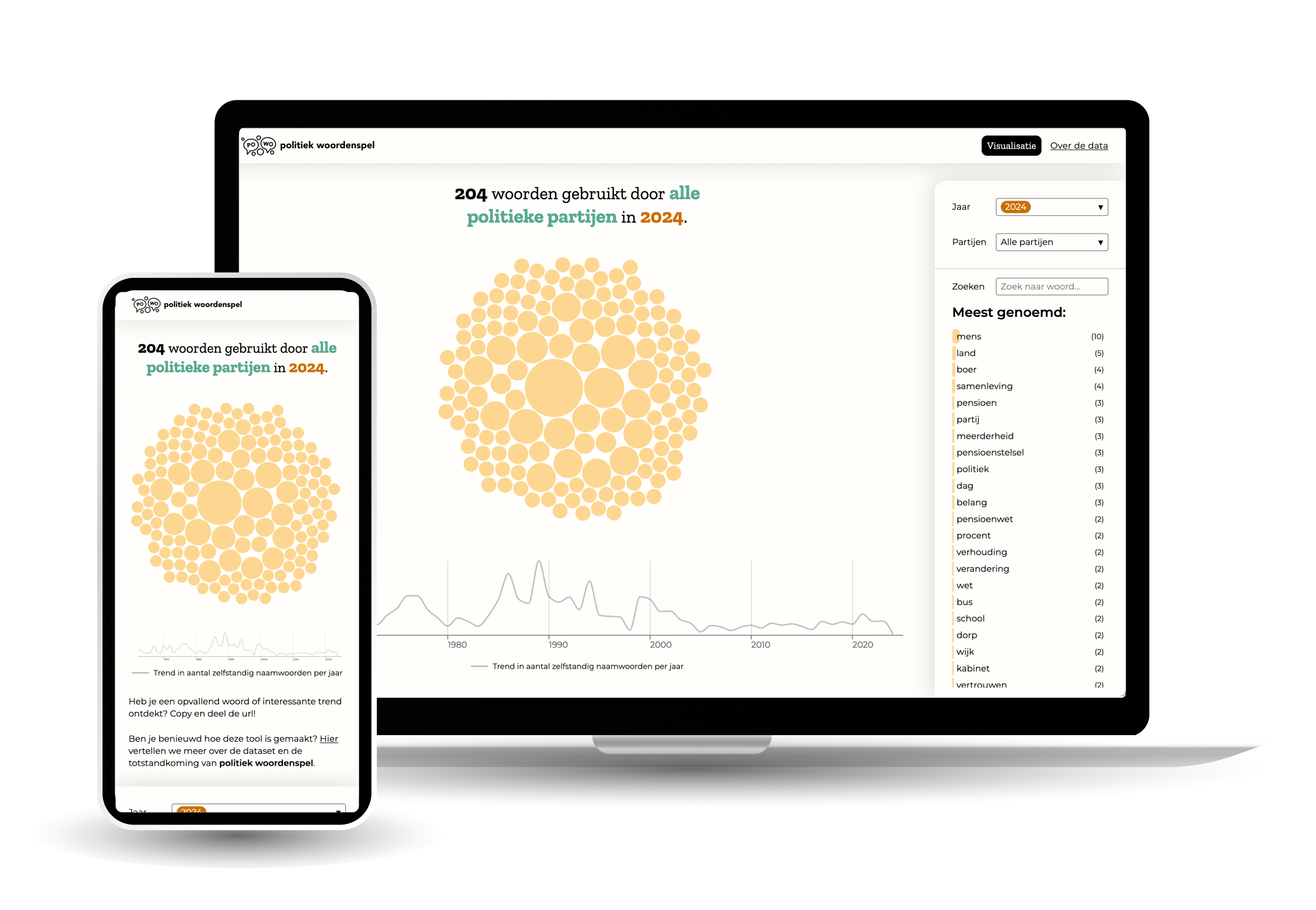
We developed an interactive and exploratory tool that allows users to examine the language used in Dutch political commercials. The tool also helps users identify trends over time and connects these words to the political parties that employed them. I was responsible for transforming these ideas into an intuitive and engaging concept and interface, ensuring that the communication goals were effectively met. Additionally, I handled the visual design of the tool.
Developing the concept
At the start, we kept our options open regarding what we wanted to communicate and which data to use. Therefore, I took the initiative to conceptualize and sketch various ideas for potential designs and interfaces. These sketches became crucial starting points, sparking new ideas and inspiring the team to explore different directions. This iterative process eventually led us to the final design. While developing the concepts, I prioritized creating a dynamic interface that offered numerous exploration options, putting user agency and discovery at the forefront. At the same time, I ensured that the interface could highlight trends at a glance, making them immediately noticeable.
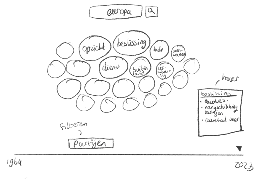
Various sketches made in early development
Solving challenges in the process
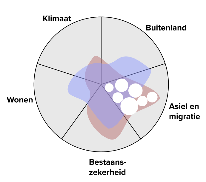
A key challenge was making the large dataset of commercial transcripts accessible and intuitive. I first explored ways to visualize text and words as data points, using online resources for guidance. The next step was to derive meaning from these words—beyond their usage, what do they signify? I considered approaches like categorizing words into themes and showing trendlines over time. Together with the team, we prioritized the most important elements for the visualization and journalistic stories, while ensuring technical feasibility.
Creating the visual design
After finalizing the design, I began working on the visual design. I created mood boards to gather inspiration and focused on delivering a clean, clear, and attractive design, as shown below. Collaborating with the development team, we simplified the design to fit within the available timeframe, ensuring the project’s timely completion.
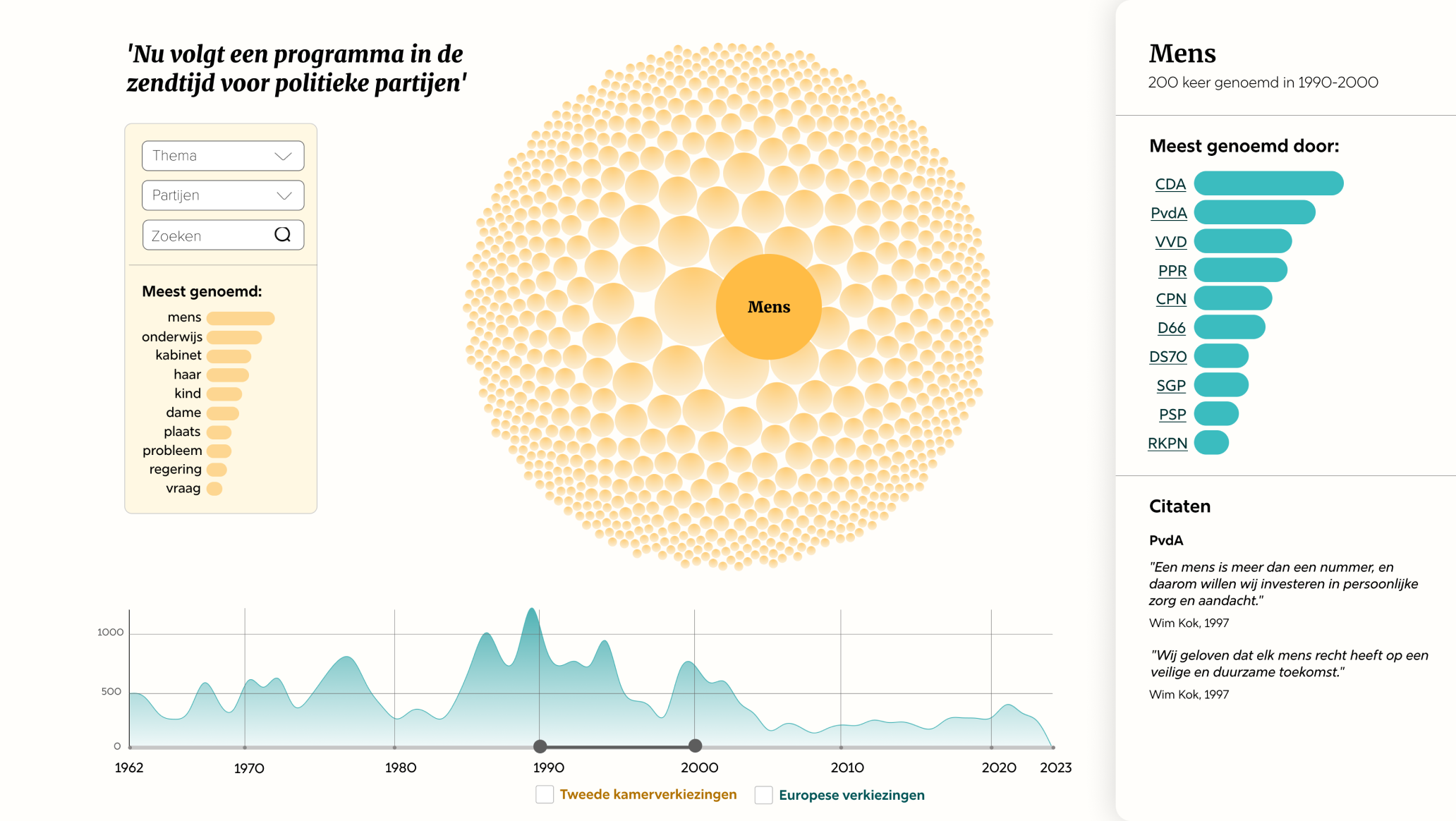
High-fidelity version of the interface